10 Designer-Approved Colors That Match With Gray in 2026
- Jan 14
- 16 min read
Gray is the ultimate chameleon of interior design, but its true power lies in its pairings. Moving beyond simple white or black, the right color combination can transform a gray foundation from standard to stunning. Whether you're staging a home for sale, planning a renovation, or just refreshing your space, understanding which colors that match with gray is key to creating a cohesive and intentional look. This skill is fundamental to building a strong visual foundation. For a more comprehensive understanding of color theory and its application, you might find valuable insights in an expert's guide to the perfect color palette.
In this guide, we explore 10 designer-approved color combinations that work with various gray undertones: cool, warm, and neutral. We'll provide specific examples, actionable tips, and show you how to visualize these palettes in your own room using Decor8 AI. This will ensure you can move from inspiration to a perfectly executed design with confidence. Forget generic advice; this list is your roadmap to unlocking the sophisticated, dramatic, or calming potential hidden within your favorite shade of gray. Let's dive into the palettes that will elevate your space.
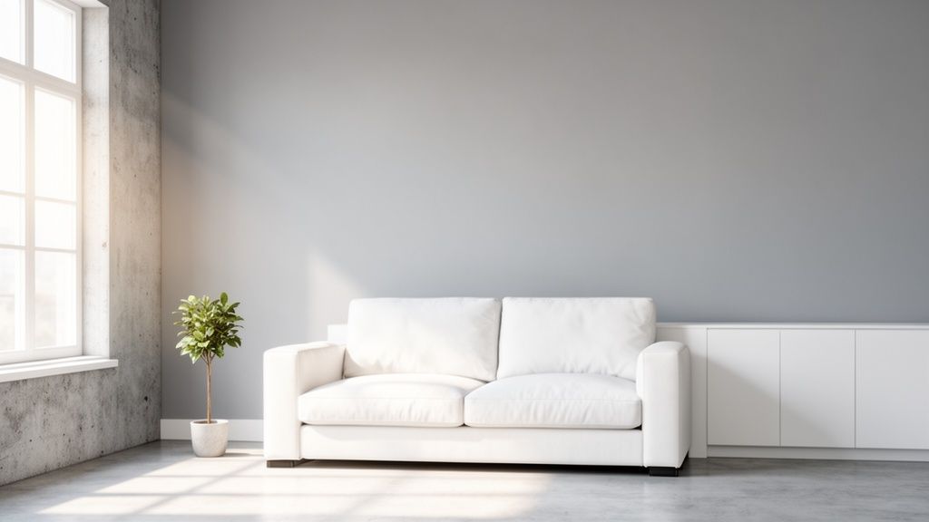
1. Gray + White: The Minimalist Foundation
Pairing gray with white is a timeless strategy for creating a clean, sophisticated, and light-filled space. This classic combination forms the backbone of minimalist, Scandinavian, and modern design by maximizing light and creating a sense of openness. It’s one of the most versatile color palettes that match with gray, serving as a neutral canvas that allows architectural details and textures to stand out. The simplicity of gray and white makes rooms feel larger, calmer, and effortlessly elegant, making it an ideal choice for staging properties or designing a serene home environment.
Why It Works
This duo excels at creating visual balance. Gray provides depth and grounding, while white reflects light, preventing the space from feeling stark or cold. The result is a high-contrast yet harmonious look that feels both intentional and inviting. Its neutrality makes it a perfect foundation for adding pops of color or rich textures later on. This pairing is particularly effective in spaces like kitchens with gray cabinets and white countertops or living rooms with gray walls and crisp white trim.
How to Implement It
Choose Your Undertones: Select a gray with the right undertone for your space. A cool gray like Benjamin Moore's 'Gray Owl' (#D4D5C7) pairs well with a pure, crisp white like 'Chantilly Lace' (#F3F4F0) for a modern feel. A warmer gray, or greige, works better with off-whites for a cozier atmosphere.
Layer Textures: To prevent the minimalist palette from feeling flat, introduce varied textures. Think of a nubby wool throw, a linen sofa, smooth concrete accents, or a light-grained wood floor.
Use Decor8 AI: Visualize this combination instantly. Use the Virtual Staging tool to place white furniture against different gray wall colors in your property photos. The AI can also help you see how the pairing looks in different lighting conditions with the day-to-dusk enhancement feature.
For more ideas on applying this aesthetic, explore these essential tips for creating a minimalist dining room.
2. Gray + Charcoal: The Sophisticated Drama
Creating a monochromatic look with gray and charcoal delivers a powerful dose of modern sophistication and dramatic flair. This pairing uses varying depths of gray to build visual interest and an elegant, layered atmosphere without introducing new colors. Charcoal acts as a potent accent to lighter grays, perfect for creating striking focal points like an accent wall, bold trim, or statement furniture. This combination is especially effective in high-end property marketing and luxury staging, where crafting an aspirational, moody environment is key to attracting buyers.
Why It Works
This duo masters the art of high-contrast, low-complexity design. The deep, rich tones of charcoal ground the space and add a sense of luxury, while lighter grays provide balance and prevent the room from feeling too dark. The result is a cohesive and curated look that feels both daring and refined. It’s a go-to palette for creating intimate spaces like bedrooms or formal living areas where you want to evoke a sense of calm sophistication. This is one of the most impactful color palettes that match with gray for a modern, upscale feel.
How to Implement It
Create a Focal Point: Use charcoal on a single accent wall or a key architectural feature to draw the eye without overwhelming the space. A deep charcoal like Sherwin-Williams' 'Iron Ore' (#2D2D2A) pairs beautifully with a softer mid-tone gray like 'Mindful Gray' (#C3C0B8).
Balance with Light and Texture: Introduce warm lighting to soften the drama and add coziness. Complement the smooth, dark surfaces with varied textures, such as a velvet sofa, a faux fur throw, or metallic accents like brass or gold fixtures to enhance the luxurious feel.
Use Decor8 AI: Visualize the impact of a charcoal accent before committing. Use the Color Picker tool to test shades like 'Iron Ore' on one wall in your photo. The AI’s twilight enhancement feature can also show how the deep, moody tones will look in romantic evening lighting.
3. Gray + Navy Blue: The Sophisticated Blue-Gray Harmony
Pairing gray with navy blue creates a classic, calming palette that evokes a sense of stability, sophistication, and trust. This combination is a cornerstone of coastal, contemporary, and transitional design, where the deep, grounded nature of navy acts as a powerful accent against a lighter gray backdrop. As one of the most distinguished colors that match with gray, this duo feels both timeless and modern. For property staging, it appeals to professional homebuyers by creating a serene and composed atmosphere that feels established and well-designed.
Why It Works
This pairing strikes a perfect balance between cool neutrality and rich depth. Gray provides a soft, versatile canvas that prevents the powerful navy from overwhelming the space, while navy offers a strong visual anchor that gives the room purpose and character. The combination feels confident and intellectual, making it ideal for home offices, master bedrooms, or formal living areas. It's less stark than black-and-gray and offers more personality than a purely neutral palette.
How to Implement It
Select Complementary Tones: A cool, light gray like Sherwin-Williams' 'Repose Gray' (#D4D0C7) provides a crisp, airy foundation for a classic, deep navy like Benjamin Moore's 'Hale Navy' (#4F5864).
Add Warmth with Accents: To prevent the combination from feeling too cool, introduce warm elements like brass or gold hardware, leather upholstery, or light-toned wood furniture. Cream or white textiles also help lift the palette.
Use Decor8 AI: Not sure about a full navy wall? Use the Virtual Staging tool to test a navy accent wall in your listing photos while keeping the other walls gray. The AI can also help you place navy furniture or decor to see how it grounds the space without committing to paint.
For more inspiration on using this color family, check out these 10 timeless blue dining room ideas.
4. Gray + Warm Beige: The Welcoming Neutral Bridge
Combining the coolness of gray with the gentle warmth of beige creates "greige," a sophisticated and highly versatile neutral. This pairing acts as a bridge between contemporary and traditional styles, offering modern sleekness from the gray and cozy comfort from the beige. The result is a balanced, inviting, and layered look that feels both timeless and current. This palette is a stager’s secret weapon, as it appeals to a broad audience by creating a welcoming yet polished atmosphere.
Why It Works
This combination succeeds by harmonizing opposite ends of the neutral spectrum. The cool undertones in many grays are softened by the warm, earthy notes of beige, preventing the space from feeling sterile. This creates a rich, dimensional neutral backdrop that is more dynamic than a single-color scheme. It’s one of the most effective color palettes that match with gray for crafting a sophisticated, high-end look without sacrificing warmth.
How to Implement It
Balance the Tones: Choose a mid-tone gray like Sherwin-Williams' 'Agreeable Gray' (#D4CDC3) and pair it with a soft, warm beige such as 'Accessible Beige' (#D1C7B8). Use one as the dominant wall color and the other for upholstery, trim, or cabinetry.
Introduce Natural Textures: Enhance the warmth of the beige by incorporating natural wood tones, woven baskets, or linen textiles. These elements tie the two neutrals together seamlessly.
Use Decor8 AI: This is a perfect palette for virtual staging. Use the Virtual Staging tool to furnish an empty room with beige sofas and rugs against gray walls. You can also use the Color Changer feature to test different shades of gray and beige on walls or floors to find the perfect balance before committing.
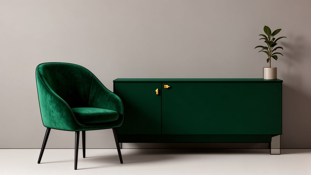
5. Gray + Emerald Green: The Nature-Inspired Luxury Accent
Pairing a deep, jewel-toned emerald green with gray creates an atmosphere of sophisticated luxury and a connection to the natural world. This dynamic combination uses gray as a grounding, modern base, allowing the vibrant and elegant emerald to command attention without overwhelming the space. The result is a palette that feels both opulent and organic, making it a popular choice in high-end interior design, boutique hotels, and contemporary homes seeking a touch of drama.
Why It Works
This combination balances neutrality with vibrancy. Gray provides a calm, understated backdrop that prevents the rich emerald from feeling too intense, while the green injects life, energy, and a sense of refined elegance. It’s a versatile pairing that works beautifully in a moody, dark gray setting for a dramatic effect or with a light, cool gray for a fresher, more contemporary feel. This duo is one of the best colors that match with gray for creating a memorable focal point.
How to Implement It
Choose a Rich Green: Opt for a deep, saturated emerald like Sherwin-Williams' 'Evergreens' (#20372A). Pair it with a mid-tone, neutral gray such as Farrow & Ball's 'Plummett' (#596163) to create a balanced, high-contrast look.
Create an Accent: Use emerald green for a feature wall, kitchen island cabinetry, or a large piece of furniture like a velvet sofa. This provides a powerful visual impact without oversaturating the room.
Enhance with Metallics: Introduce brass or gold fixtures and accents. The warmth of these metals beautifully complements the cool depth of emerald green and the neutrality of gray, amplifying the luxurious feel.
Use Decor8 AI: Before painting, use the Virtual Staging tool to test an emerald green accent wall in your property photos. You can also experiment with staging emerald-colored virtual furniture to find the perfect balance for your space.
For additional guidance on selecting the perfect shades for your project, learn more about how to choose the right paint color.
6. Gray + Soft Blush Pink: The Modern Romantic Blend
Pairing a cool-toned gray with soft blush pink creates a modern, sophisticated, and surprisingly serene space. This contemporary combination moves beyond traditional romantic palettes, offering a grown-up, trendy, and even gender-neutral appeal. It's an excellent choice for crafting a calm yet stylish atmosphere, making it one of the most popular colors that match with gray for bedrooms, living rooms, and even chic home offices. The blend of cool gray’s stability with pink’s gentle warmth results in a balanced and inviting interior.
Why It Works
This pairing strikes a perfect balance between cool and warm, masculine and feminine. Gray provides a solid, modern foundation that prevents the blush tones from feeling overly sweet or juvenile. The soft pink, in turn, introduces warmth and a touch of color that enlivens the gray and adds emotional depth. This combination is particularly effective in spaces designed for relaxation, as it feels both comforting and chic, appealing to a broad demographic in real estate staging.
How to Implement It
Choose the Right Tones: A cool, mid-tone gray like Sherwin-Williams' 'Repose Gray' (#D0CAC2) creates a sophisticated backdrop for a muted, dusty blush like Farrow & Ball's 'Setting Plaster' (#E1D2C6). Avoid bright or hot pinks to maintain a modern aesthetic.
Balance with Accents: Introduce blush pink through textiles like velvet cushions, upholstered furniture, or an accent wall. Complement the palette with metallic finishes, such as brass or rose gold, to add a layer of warmth and luxury.
Use Decor8 AI: Not sure how much blush is too much? Use the Virtual Staging tool to experiment with a blush pink accent chair or rug in a gray room. The AI can instantly render different options, helping you find the perfect balance without committing to paint or purchases.
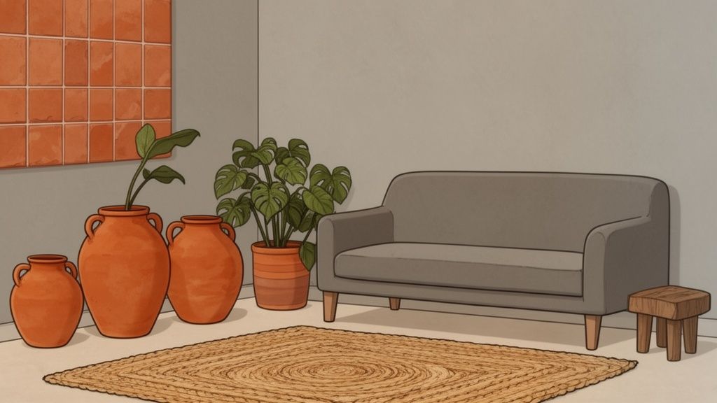
7. Gray + Warm Terracotta: The Earthy Bohemian Fusion
Pairing gray with warm terracotta creates an earthy, bohemian-inspired palette that balances modern minimalism with natural, organic warmth. Terracotta brings a sense of authenticity and handcrafted charm, while gray keeps the aesthetic contemporary and grounded. This combination is one of the most inviting color palettes that match with gray, ideal for creating a space that feels both stylish and lived-in. It is particularly effective in transitional, eclectic, and global design styles, resonating with those who seek warmth and personality.
Why It Works
This pairing succeeds by creating a beautiful contrast between cool and warm tones. Gray’s neutrality provides a sophisticated, modern backdrop that allows the rich, sun-baked quality of terracotta to pop without overwhelming the space. The result is a balanced and harmonious environment that feels both grounding and vibrant. This combination is perfect for a living room with gray walls and terracotta accents or a kitchen with gray cabinets and a warm terracotta backsplash.
How to Implement It
Choose the Right Tones: A mid-tone, neutral gray like Sherwin-Williams' 'Agreeable Gray' (#D0C9C0) lets the warmth of terracotta shine. Pair it with an authentic, earthy terracotta shade like 'Cavern Clay' (#B57B62) for a rich, organic feel.
Layer with Natural Textures: Enhance the bohemian vibe by introducing natural materials. Incorporate woven baskets, jute rugs, linen textiles, and light-toned wood to complement the earthy palette.
Use Decor8 AI: Visualize the impact of this pairing with the Virtual Staging tool. Add terracotta-colored accent pieces like pottery, cushions, and artwork to a room with gray walls to see how it warms up the space. The AI can instantly show you the perfect balance before you commit.
Discover how to master this aesthetic by exploring these tips on achieving a free-spirited interior design style.
8. Gray + Soft Black Trim: The Classic Refined Contrast
Pairing gray walls with soft black trim is a sophisticated strategy for creating sharp, architectural definition. This classic combination uses black on elements like window frames, door frames, baseboards, and railings to frame the softer gray, adding depth and a sense of intention. It’s one of the most impactful color palettes that match with gray for highlighting a room’s structure. This approach brings a graphic, polished quality to both traditional and contemporary spaces, making rooms feel grounded, elegant, and visually striking in property photography.
Why It Works
This pairing creates a powerful but balanced contrast that draws the eye to a room’s best features. The gray acts as a neutral, calming backdrop, while the black trim functions as a bold outline, emphasizing lines and shapes without overwhelming the space. The result is a refined look that feels both classic and modern. This is particularly effective in transitional kitchens with gray walls and black hardware or living rooms where black window frames create a picture-perfect view of the outdoors.
How to Implement It
Select Your Shades: For maximum impact, pair a mid-tone gray like Sherwin-Williams' 'Agreeable Gray' (#D2CBC3) with a true, deep black such as 'Tricorn Black' (#2D2A2B). This ensures the contrast is crisp and intentional.
Balance with Warmth: To prevent the space from feeling too austere, introduce warm elements through wood furniture, leather accents, brass fixtures, and soft textiles. Warm lighting is also crucial for creating an inviting atmosphere.
Use Decor8 AI: Before committing, visualize the effect using AI. Use the Virtual Staging tool to apply black trim to your existing property photos with gray walls. This helps you see precisely how the contrast defines the space and ensures it aligns with your vision.
For more inspiration on using accent colors effectively, check out these timeless trim color ideas.
9. Gray + Soft Gold Accents: The Luxe Contemporary Statement
Pairing gray with soft gold accents is a powerful way to create a luxurious and contemporary aesthetic. Instead of using gold on large surfaces, this combination relies on strategic touches through fixtures, hardware, and decorative elements. This approach adds warmth and opulence to gray's cool neutrality, making any room feel instantly more sophisticated and high-end. It's a go-to combination for luxury hotel design and premium real estate marketing, as it elevates a space from simple to aspirational.
Why It Works
This pairing strikes a perfect balance between modern minimalism and classic glamour. Gray serves as a sophisticated, understated backdrop, allowing the metallic warmth of gold to shine without overwhelming the space. The contrast between the cool, matte finish of a gray wall and the warm, reflective quality of gold creates a dynamic visual tension. This makes it one of the most effective color palettes that match with gray for spaces like master bathrooms with gray tiles and gold faucets or kitchens with charcoal cabinets and gold hardware.
How to Implement It
Focus on Warm Tones: Opt for a soft, brushed gold rather than a cool, shiny brass to maintain a contemporary feel. A warm gray like Sherwin-Williams' 'Agreeable Gray' (#D4CCC3) provides a beautiful base for a rich gold like 'Satin Brass' (#C4A877).
Apply Strategically: Use gold for accents like cabinet pulls, mirror frames, light fixtures, and table legs. The key is to sprinkle these elements throughout the room for a cohesive look rather than concentrating them in one area.
Use Decor8 AI: Visualize the impact of gold hardware instantly. Use the Virtual Staging tool to swap out standard silver fixtures for gold ones on gray kitchen cabinets or bathroom vanities. This helps ensure the balance is right and the look isn't excessive before you commit.
10. Gray + Muted Sage Green: The Calming Biophilic Design
Combining gray with muted sage green creates a nature-inspired, biophilic design that fosters a deep sense of calm and wellness. This pairing moves away from vibrant greens to embrace a softer, more subdued hue that turns any room into a therapeutic sanctuary. This combination is one of the most serene colors that match with gray, appealing directly to a growing desire for homes that support well-being. It is exceptionally effective in bedrooms, bathrooms, and living areas where relaxation is the primary goal.
Why It Works
This duo connects the built environment with the natural world. Gray provides a stable, grounding backdrop reminiscent of stone or overcast skies, while sage green evokes the gentle hues of nature. The result is a balanced, earthy palette that reduces stress and enhances tranquility. This pairing is central to the biophilic design trend, which emphasizes creating a visual connection with nature to improve health and happiness, making it highly attractive to modern home buyers.
How to Implement It
Select the Right Tones: A cool, light gray like Sherwin-Williams' 'Silverplate' (#C5C6C8) beautifully complements a soft, earthy sage like 'Clary Sage' (#D4CDBA). This keeps the atmosphere light and airy while maintaining the calming effect.
Emphasize Natural Elements: Enhance the biophilic aesthetic by incorporating natural wood tones, stone accents, and plenty of live plants. For those looking to integrate more natural aesthetics, exploring indoor cactus garden ideas for architectural beauty can create a unique, calming atmosphere that pairs wonderfully with muted sage green.
Use Decor8 AI: Visualize the impact of this pairing with precision. Use the Virtual Staging tool to paint a single sage green accent wall behind a bed or to color kitchen cabinets in sage within a gray-walled room. The AI color picker can help you test different sage undertones to find the perfect match for your specific gray.
Top 10 Gray Color Pairings
Style | 🔄 Implementation complexity | ⚡ Resource requirements | 📊 Expected outcomes | Ideal use cases | ⭐ Key advantages |
|---|---|---|---|---|---|
Gray + White: The Minimalist Foundation | Low — straightforward paint/finish choices | Low — common paints, minimal staging | ⭐⭐⭐⭐ — maximizes light; appears larger and clean | Minimalist, Scandinavian, vacant staging, kitchens | ⭐ Universally appealing; easy to photograph |
Gray + Charcoal: The Sophisticated Drama | Medium — balance of tones and lighting required | Medium — accent finishes, targeted lighting | ⭐⭐⭐⭐ — strong focal contrast; photogenic drama | Luxury listings, executive offices, accent walls | ⭐ Elegant, upscale look; hides minor imperfections |
Gray + Navy Blue: The Sophisticated Blue-Gray Harmony | Medium — need to match undertones carefully | Medium — quality paint, select furnishings | ⭐⭐⭐⭐ — calming depth; composed and trustworthy | Coastal, transitional living rooms, bedrooms | ⭐ Timeless, good for families; high visual depth |
Gray + Warm Beige: The Welcoming Neutral Bridge | Medium — undertone coordination important | Low–Medium — paint and warm textiles | ⭐⭐⭐⭐ — broad buyer appeal; cozy yet modern | Family homes, open-concept staging, transitional spaces | ⭐ Balances warm + cool; highly versatile |
Gray + Emerald Green: The Nature-Inspired Luxury Accent | Medium–High — confident, limited application recommended | Medium — quality finishes, accent pieces | ⭐⭐⭐⭐ — high-impact, luxurious focal points | High-end kitchens, feature cabinetry, premium staging | ⭐ Creates memorable, luxury-forward spaces |
Gray + Soft Blush Pink: The Modern Romantic Blend | Medium — careful undertone and restraint needed | Low–Medium — accents, textiles, metallics | ⭐⭐⭐ — trendy and photogenic; best as accents | Modern bedrooms, bathrooms, design-forward listings | ⭐ Instagrammable; youthful yet sophisticated |
Gray + Warm Terracotta: The Earthy Bohemian Fusion | Medium — skilled styling to avoid clutter | Medium — tiles, pottery, natural textiles | ⭐⭐⭐⭐ — warm, lived-in character; distinctive | Bohemian/eclectic homes, sustainable design, kitchens | ⭐ Earthy warmth; pairs well with natural materials |
Gray + Soft Black Trim: The Classic Refined Contrast | Low–Medium — precise trim work and intent | Low — paint and hardware updates | ⭐⭐⭐⭐ — crisp architectural definition; polished photos | Any style needing definition; staircases, windows, doors | ⭐ Timeless contrast; conceals wear on trim |
Gray + Soft Gold Accents: The Luxe Contemporary Statement | Medium — consistent metal finishes needed | Medium — quality fixtures and lighting | ⭐⭐⭐⭐ — elevates perceived value; luxe photography | Luxury bathrooms, living rooms, premium kitchens | ⭐ Immediately uplifts and markets as premium |
Gray + Muted Sage Green: The Calming Biophilic Design | Medium — correct sage undertone selection | Low–Medium — paint, plants, natural materials | ⭐⭐⭐⭐ — calming, wellness-oriented environments | Bedrooms, spa-like bathrooms, wellness-focused homes | ⭐ Biophilic, stress-reducing; appeals to eco-conscious buyers |
From Palette to Perfection: Your Next Steps
Gray is far more than a simple, safe neutral; it is a dynamic foundation brimming with potential. Throughout this guide, we've explored a spectrum of possibilities, moving beyond the idea of a single "correct" color and into a world of intentional pairings. From the crisp, minimalist foundation of gray and white to the luxurious drama of emerald green, each combination tells a unique story. We've seen how understanding gray's undertones, whether cool, warm, or perfectly balanced, is the key to unlocking its true power.
The most critical takeaway is that the "perfect" match is deeply personal and context-dependent. A sophisticated gray and navy blue pairing might create a focused, professional home office, while the same gray paired with a warm terracotta could transform a living room into an earthy, bohemian sanctuary. Your choice of colors that match with gray directly influences the mood, energy, and perceived style of your space. It's not just about aesthetics; it's about crafting an environment that supports and inspires you.
Mastering the Art of Application
Now that you have a curated palette of ideas, the next step is to move from inspiration to implementation. Remember these core principles as you begin your design journey:
Test Your Tones: Always sample paint colors in your actual space. A cool gray that looks perfect online might appear sterile under the warm afternoon sun in a west-facing room. Test swatches on multiple walls to see how they interact with your home's unique lighting throughout the day.
Balance is Key: When using a bold accent like emerald green or a deep charcoal, remember the 60-30-10 rule. Use your primary gray as the dominant color (60%), a secondary neutral for 30%, and your vibrant accent for the final 10% through decor, textiles, or a feature wall.
Texture Adds Depth: A monochromatic gray-on-gray scheme can feel flat without textural variation. Introduce different materials like a chunky wool throw, a smooth leather chair, a metallic lamp, or a linen curtain to create visual interest and a sense of layered sophistication.
Visualize Your Vision Before You Begin
The single greatest challenge in interior design is bridging the gap between imagination and reality. Guessing how a specific shade of sage green will look with your existing gray sofa can be a costly and frustrating exercise. This is where modern tools become indispensable, removing the uncertainty and empowering you to make confident decisions. Visualizing your chosen palette in your own room is no longer a luxury; it's an essential step for a successful project.
By applying these palettes virtually, you can experiment freely without any commitment. See for yourself how soft gold accents elevate a mid-tone gray, or decide if the contrast of soft black trim is too dramatic for your bedroom. This process transforms your design from a hopeful guess into a well-planned masterpiece, ensuring the final result is exactly what you envisioned.
Ready to see these color pairings in your own home? Stop guessing and start visualizing. With Decor8 AI, you can upload a photo of your room and instantly test paint colors, experiment with furniture styles, and see how these stunning gray combinations come to life. Try it now and design your perfect space with confidence.
Comments