How to choose paint colors for entire house: A practical guide to color harmony
- Feb 8
- 15 min read
Choosing paint colors for your entire house boils down to one simple idea: telling a single, unified color story. Forget picking colors room by room in isolation. The secret is to build a master palette with a go-to neutral, a consistent trim color, and a handful of accent shades that flow beautifully from one space to the next. This is how you get that intentional, professionally designed feel.
Your Blueprint for a Cohesive Home Color Palette
Staring down an entire house paint project can feel massive, but a simple blueprint changes everything. The goal isn't to make every room the same color—far from it. It's about creating a sense of harmony where each room feels connected to the next. The colors you choose should work together to build a specific mood throughout your home.
This whole process starts with the big picture. Before you even glance at a paint chip, ask yourself: how do I want my home to feel?
Calm and Serene? You’ll probably lean toward soft blues, gentle greens, and warm, creamy off-whites.
Warm and Vibrant? This might call for earthy terracotta, a deep navy, or rich, moody greens.
Bright and Airy? This look is often built on clean whites, light grays, and subtle, sun-washed pastels.
The 3 Core Components of Your Palette
Once you’ve locked in a mood, you can start building the 3 essential components of your whole-house palette. I’ve found this methodical approach is the key to getting it right every time.
This simple flow shows you how to move from the abstract (mood) to the concrete (your actual paint colors).
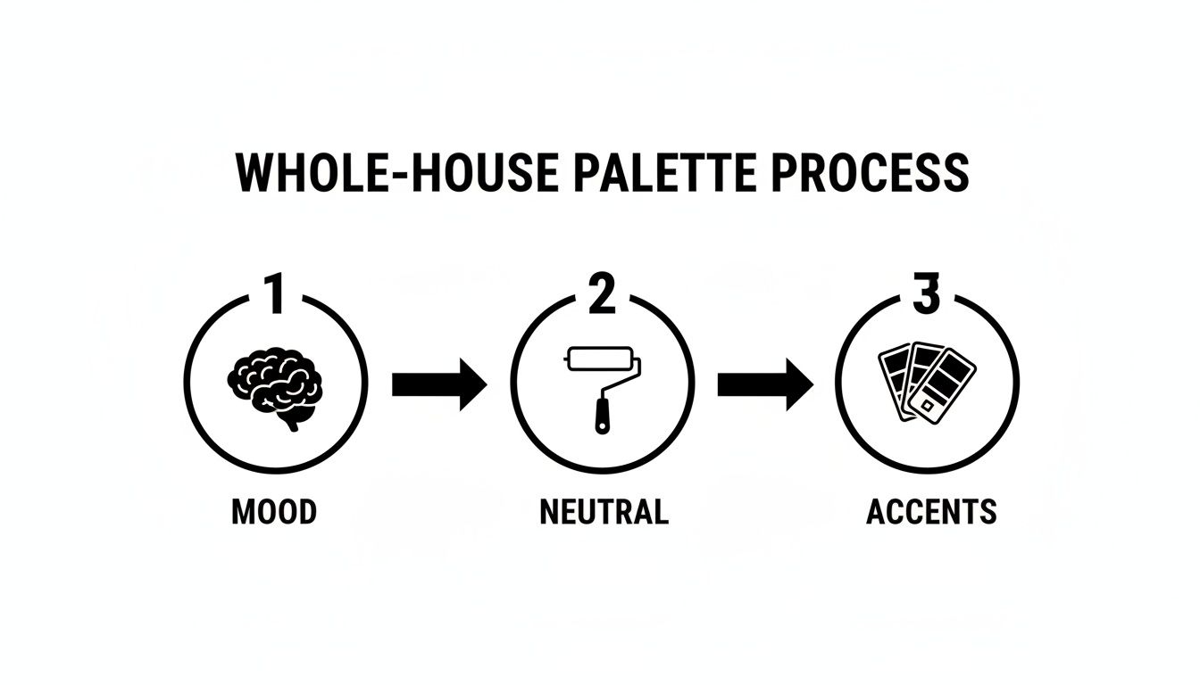
As you can see, a great palette isn't just a random assortment of pretty colors. It's a strategic selection built on a foundation of feeling and function. If you're struggling to nail down your vibe, taking a quick quiz to discover your design personality can be a surprisingly helpful starting point.
The secret to a cohesive home isn't about matching everything perfectly. It's about creating a conversation between colors, where each shade complements the others and adds to a unified story.
Of course, your walls are just one piece of the puzzle. When crafting your home's color scheme, don't forget that fixed elements like your floors play a huge role. Their undertones can dramatically change how a paint color looks in the room. It’s worth exploring options for Refinishing Hardwood Floors Colors to ensure your whole look is in sync.
The table below breaks down the foundational elements of a whole-house palette, giving you a clear framework to build from.
The Whole-House Color Palette Framework
Palette Component | Purpose | Where to Use |
|---|---|---|
Main Neutral | The workhorse color that creates flow and consistency. | Open-concept areas, hallways, and main living spaces. |
Trim & Ceiling | Provides a crisp, clean frame and visual continuity. | All trim, baseboards, doors, and ceilings throughout the house. |
Accent Colors (2-3) | Adds personality, depth, and character to individual rooms. | Bedrooms, bathrooms, offices, or on a single feature wall. |
This framework keeps you from getting overwhelmed by choice. Instead of staring at thousands of colors, you're focused on finding just 5-6 key shades that work together to tell your home's story.
Finding Your Foundation: The Perfect Neutral
Every great whole-house color scheme starts with one perfect neutral. This is your anchor color, the one that does the heavy lifting to connect all your open spaces—think hallways, foyers, and that big open-plan living area. It creates that seamless flow everyone is after.
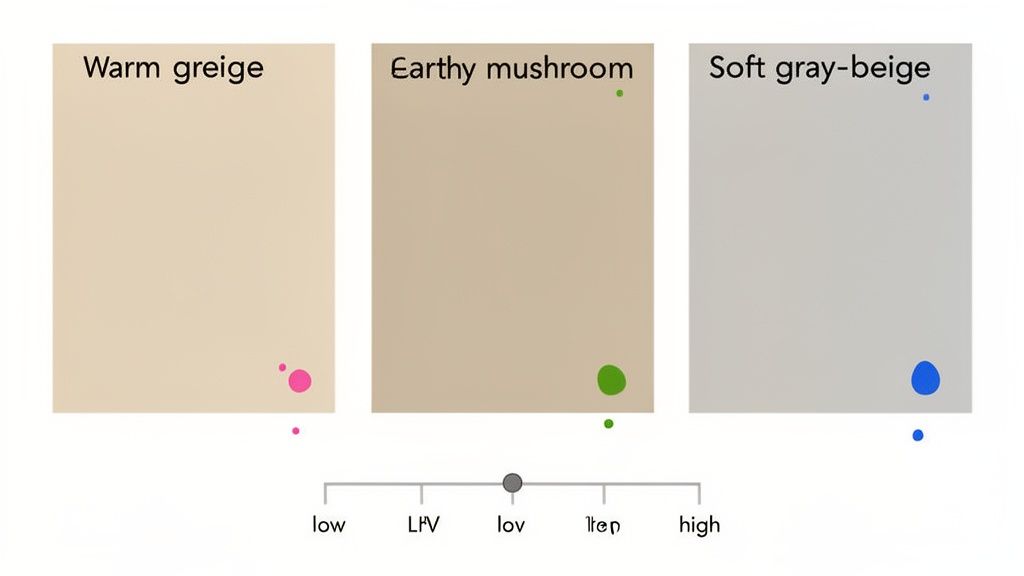
When I say "neutral," please don't picture the flat, boring beige from the 90s. Today's neutrals are so much more sophisticated. We're talking about warm greiges, earthy mushroom tones, and soft, airy off-whites that have real depth and character. This foundational color truly sets the stage for everything else.
Here's the single most important thing to get right: the undertones. These are the sneaky little hints of other colors hiding inside a neutral—a touch of pink, a whisper of green, a hint of blue. You might see a greige paint chip that looks perfectly gray, but once it's on all four walls, it suddenly flashes a weird purple hue that fights with your warm oak floors. It happens all the time.
Decoding Undertones and Your Home's "Fixed" Elements
The trick is to match your neutral's undertone to the elements in your home that you aren't changing. I call these the "fixed" elements.
Flooring: Look at your wood floors. Do they lean golden-yellow, or are they a cooler, ashy brown?
Countertops: Get up close with your stone countertops. Do you see flecks of warm cream in the veining, or is it more of a cool blue-gray?
Big Furniture: That giant sectional sofa has a color temperature. Your paint needs to get along with it.
Cabinetry: Kitchen and bathroom cabinets are huge visual anchors with very distinct undertones.
To spot an undertone, just hold the paint chip against a piece of pure white printer paper. The stark contrast makes the hidden color pop right out. That greige might suddenly look way more green than you realized. This simple trick is your first line of defense against making a costly mistake. If you want to dive deeper, this guide on creating a neutral color palette has some fantastic pointers.
Don't Forget About Light Reflectance Value (LRV)
Beyond undertones, there's another number you need to know: Light Reflectance Value (LRV). You'll usually find it on the back of the paint swatch. It’s a simple scale from 0 (absolute black) to 100 (pure white) that tells you exactly how much light a color will reflect.
Think of LRV as a practical tool. It helps you predict how a color will actually behave in your room. A high LRV bounces light around, making a space feel bigger and brighter. A low LRV absorbs light, creating a cozier, more intimate vibe.
Here’s a quick cheat sheet:
High LRV (60-85+): Perfect for small rooms, dark hallways, or anywhere you need to maximize light. There's a reason colors like Benjamin Moore’s Simply White (LRV 91.7) are so popular.
Mid-Range LRV (35-60): These are the workhorses. They provide soft, welcoming color without darkening a room. Benjamin Moore's Edgecomb Gray (LRV 63.89) is a classic example of a versatile mid-range neutral.
Low LRV (0-35): Use these to create a moody, dramatic feel. They’re fantastic for a dining room, powder room, or a home office where you want that cozy, enveloping atmosphere.
We're definitely seeing a trend toward warmer, more comforting neutrals. While beige and cream have been popular for years, we're now seeing warmer greiges and khaki tones push out the cooler grays. Just look at Sherwin-Williams' Color of the Year, Universal Khaki SW 6150. They analyzed data from over 1.2 million color consultations and found this color works with 85% of existing home materials. It’s a testament to its calming simplicity.
Of course, the right neutral also has to fit your personal style. If you love a clean, uncluttered look, our guide to the minimalist interior design style has great tips on using neutrals to their full potential.
Ultimately, your foundational neutral is the common thread that pulls your entire home together. By paying close attention to its undertones and LRV, you can pick a color that doesn’t just look good on a chip but truly enhances your home’s light and architecture, creating a beautiful, cohesive backdrop for your life.
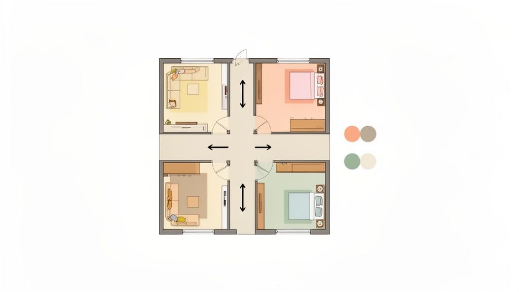
Building Your Palette with Accents and Trims
With your main neutral decided, this is where the personality of your home really starts to take shape. It’s time to layer in the accent colors that give each room its own unique feel, transforming a series of spaces into a home with a continuous, flowing story.
The secret isn't to pick a new color for every room. Instead, choose a small, curated set of two or three accent colors that work beautifully with your primary neutral. Think of these accents as your versatile toolkit—you can use them in big or small ways to create different moods while still keeping everything connected.
This simple step is what prevents that jarring, disjointed feeling you get when room colors are chosen in isolation. It’s the difference between a collection of rooms and a truly unified home.
Choosing Versatile Accent Colors
Your accent colors should feel like they belong with your main neutral—think cousins, not complete strangers. The easiest way to do this is to make sure they share similar undertones. For instance, if your main greige has a hint of green in it, a soft sage and a deep, moody teal will feel like natural companions.
Once you have your accents, you can deploy them with different levels of intensity throughout the house:
Bedroom: Go all-in with the soft sage on every wall for a calm, restful retreat.
Home Office: Use the deep teal on all four walls to create a focused, enveloping space that helps you concentrate.
Living Room: Keep the main neutral on the walls and bring in both the sage and teal through decor—throw pillows, a piece of art, or even a painted bookcase.
With this approach, the color story unfolds naturally as you move through your home. Each room has its own identity but is clearly part of the same design family.
The Unsung Hero: Trim, Ceilings, and Doors
This is a big one, and it's where so many people go wrong. The color you choose for your trim, doors, and ceilings is arguably one of the most critical decisions for a seamless, professional look. It's the one element that physically ties every single room together.
Consistency is everything.
A crisp, bright white is the default for a reason—it creates sharp, clean lines and makes wall colors pop. But it’s not your only move.
For a softer, more integrated feel, try a warmer off-white like Benjamin Moore’s White Dove or Sherwin-Williams’ Alabaster. This works especially well if your main color palette leans warm and earthy, creating a gentler transition between the walls and trim.
The rule is simple: pick one trim color and stick with it. Use it on all baseboards, window and door casings, and interior doors. For a clean, continuous look that makes rooms feel taller, paint the ceilings the same color in a flat finish.
Bringing It All Together
Once you've narrowed down your choices, it’s time to see how they actually work together. Before you buy a single gallon of paint, using an AI Home Design tool can be a game-changer. These tools let you upload photos of your own rooms and virtually "paint" the walls, giving you a surprisingly realistic preview of the final result.
This is especially helpful for major features like kitchen cabinets, which have a huge impact on the room's overall feel. If you need some inspiration, our guide on kitchen cabinet color ideas shows how your palette can extend to fixed elements.
Ultimately, your goal is to land on a simple, intentional framework: one main neutral, one trim color, and two or three flexible accent shades. That’s it. This limited palette is the key to a home that feels both deeply personal and perfectly pulled together.
How Light and Room Function Shape Your Color Choices
A paint color on a tiny chip is just a suggestion. The moment that color goes on your wall, it starts a conversation with two powerful forces: the light in the room and how you use the space. Getting this relationship right is the secret to a color you'll love for years.
Think of natural light as the ultimate editor for your paint. It changes constantly, and the direction it comes from has a huge impact on how a color really looks and feels in your home. This isn't a step you can skip; you have to see how your choices react to your light.
This is precisely why testing paint samples at different times of the day is so critical. A warm greige that looks perfect in the soft morning sun can look flat and muddy by late afternoon.
Understanding Your Home's Natural Light
Every room's personality is shaped by its windows. The direction they face determines the temperature and intensity of the light filling the space.
North-Facing Rooms: These rooms get cool, indirect light all day long. This kind of light can easily wash out colors, making them appear duller or grayer than they are. That beautiful beige you picked? It can suddenly look sad and dingy. The trick here is to lean into warmer tones or colors with a bit more saturation to counteract that cool cast.
South-Facing Rooms: These are the complete opposite. These spaces are bathed in warm, bright light for most of the day. This intense light can amplify colors, turning a soft yellow into a screaming lemon. You'll find that cooler tones and softer neutrals often perform beautifully here, balancing the natural warmth.
East & West-Facing Rooms: Think of these rooms as chameleons. East-facing rooms get a bright, warm welcome in the morning and then cool down significantly in the afternoon. West-facing rooms are darker in the morning and come alive with a fiery, warm glow in the evening. You absolutely have to test colors in both the AM and PM to avoid any surprises.
Your home's lighting is completely unique. A color that looks stunning in a bright, south-facing living room on a design blog might fall completely flat in your north-facing family room. Trust what you see on your own walls, not just on a screen.
Matching Color to Room Function
Beyond light, the job of each room should guide your color choices. The goal is to create an atmosphere that supports what you do in there, and this is the perfect opportunity to strategically deploy your accent colors.
Let's say your accent palette includes a soft, calming blue and a deeper, more energetic green. You wouldn't use them the same way everywhere.
Room Type | Desired Vibe | How to Use Your Palette |
|---|---|---|
Bedroom | Restful and serene. | Use the soft, tranquil blue to create a relaxing retreat. |
Home Office | Focused and productive. | The deeper, stable green is perfect for encouraging concentration. |
Dining Room | Intimate and social. | Try a darker shade of your main neutral for a cozy, dramatic feel. |
Powder Room | Bold and memorable. | Go for it! This is the place for a dramatic, unexpected accent color. |
This approach lets you tailor the mood of each room while making sure every color still feels connected to the rest of the house. You're simply turning the volume up or down on certain colors to fit the function of the space.
To get a real feel for how a calming blue might work in a bedroom versus a more vibrant shade in a shared space, you can experiment with an AI Interior Design tool. These visualizers let you virtually test different colors in your own rooms, helping you see the impact of your decisions. Exploring various living room designs, for example, can show you how a single color can create vastly different moods depending on how and where you use it.
From Paint Swatches to Virtual Previews
You’ve done the hard work of building a palette, thinking about your home’s light, and mapping out how each space will feel. Now for the moment of truth: testing.
I can’t say this enough: never, ever choose a color based on that tiny two-inch paper chip from the hardware store. It’s a recipe for expensive mistakes. This is where you make sure the beautiful color story in your head actually works on your walls.
A color that looks like a soft, warm greige under the fluorescent glare of a paint store can easily turn into a muddy, depressing purple in your north-facing hallway. This final check is your safety net.
The Old-School Way: Physical Paint Samples
The tried-and-true method of sampling paint is still one of the best ways to understand a color's true personality. It’s all about getting physical samples up on a larger scale to see how they behave in your space. But please, don't just paint a small splotch directly on your current wall—it will totally skew how you see the color.
For the most accurate read, here’s what I always recommend:
Make Large Sample Boards: Grab a few pieces of white poster board or foam core. Paint two full coats of your sample color on each one, but leave a white border around the edge. This little trick stops the existing wall color from visually messing with the new shade.
Move Them Around: This is the most critical part. Put your painted boards everywhere. Prop one up next to a window, stick another on an interior wall that gets no direct light, and place one right next to your trim and your sofa.
Watch Them for 24 Hours: A color can look completely different at 9 AM than it does at 9 PM. Leave the boards up for a full day and night. See how the color shifts in the bright morning sun, the flat light of midday, and under your lamps after dark.
This physical testing is non-negotiable. It’s the only way to truly see how a color’s undertones will react to the specific light and permanent fixtures, like your flooring or countertops, in your home.
The Smarter Way: Visualizing the Big Picture
While physical samples are perfect for judging a color’s true character, they can't really show you the massive impact of that color across an entire room, let alone the whole house. This is where modern tech gives us a huge leg up, taking almost all of the guesswork out of the equation.
Tools powered by AI Home Décor technology have completely changed how we can approach this. Instead of trying to imagine what that small sample board would look like covering hundreds of square feet, you can see it in a few clicks. You just upload a photo of your room and virtually paint the walls any color you want.
This is a game-changer because the technology renders the color with realistic lighting and shadows, giving you a preview that’s incredibly close to the final result. It helps you answer the big questions that a sample board just can't:
How will this deep, moody green really look across the entire living room? Will it feel cozy and inviting, or just dark and small?
Does the soft blue I picked for the bedroom actually flow with the greige in the hallway when you see them together through the doorway?
Is the contrast between my wall color and the trim sharp enough?
Using a digital tool lets you test your entire palette—from your main neutral to your boldest accent—in every single room. You can confirm your whole-house flow and make your final calls with total confidence before a single can of paint is opened.
To see exactly what I mean, you can explore Decor8 AI's paint color visualizer and see how it bridges that gap between planning and reality. Combining physical samples with a digital preview is the ultimate one-two punch for getting your home’s color palette right the first time.
Answering Your Lingering Paint Color Questions
Even with the best plan, a few questions always seem to pop up right before the paint cans are opened. It's completely normal. Let's tackle some of the most common uncertainties people have when picking paint colors for a whole house. Getting these last few details straight will give you the confidence to move forward.
Think of this as the final check-in before you start transforming your space.
Should Every Room in My House Be the Same Color?
Definitely not! The aim is a harmonious home, not a monotonous one. A cohesive palette isn't about using a single color everywhere; it's about using a family of colors that relate to one another. This gives each room its own identity while ensuring the entire house feels connected.
Use your main neutral in the big, open spaces like the living room and hallways. This is what creates that all-important flow. Then, you can introduce your accent colors in other rooms. A bedroom might feature a lighter, more serene version of your primary neutral, or maybe a soft green that complements it beautifully.
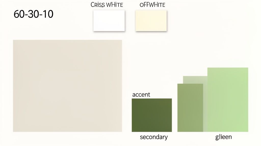
How Many Paint Colors Should I Use for the Whole House?
This is where restraint pays off. To keep your home from feeling chaotic or disjointed, it's best to stick to a curated palette of three to five colors total.
Here’s a simple, proven formula that works:
One go-to neutral for the main, connecting areas.
One consistent white or off-white for all the trim, ceilings, and interior doors.
Two or three accent colors to inject personality into bedrooms, an office, or even just a feature wall.
This simple structure gives you enough variety to make things interesting without overwhelming your senses. It’s the secret to making a home feel thoughtfully designed instead of randomly thrown together.
A limited palette isn't a boring one—it's a strategic one. When every color serves a purpose and connects to the others, the result is a home that feels calm, intentional, and beautifully complete.
How Do I Create Flow in an Open-Concept Home?
With open-concept layouts, a single, unifying neutral color is your best friend. Painting all the connected walls in one shade instantly creates a sense of cohesion and makes the entire space feel larger and more purposeful.
Once you have that consistent backdrop, you can define different zones without needing walls. Use one of your accent colors on a single feature wall behind the sofa or bring those colors in through your decor—think area rugs, artwork, and pillows. This clever approach lets the space feel open and airy while still carving out distinct, functional areas for living, dining, and relaxing.
What Are the Biggest Mistakes to Avoid When Choosing Paint?
A few common missteps can easily derail a great plan. Just knowing what they are can help you steer clear.
The number one mistake I see is people choosing a color under the harsh fluorescent lights of a hardware store. It will look completely different at home. You absolutely must test large paint swatches on your actual walls to see them in your home's unique light throughout the day.
Another classic error is ignoring undertones. That perfect greige you picked might have a sneaky pink undertone that clashes horribly with your yellow-toned wood floors. Lastly, people often choose colors for rooms in isolation. Stand in the doorway of your living room and look into the dining room. How do those two colors feel next to each other? An AI Room Design tool can be a huge help here, allowing you to preview those transitions before you ever pick up a brush.
Ready to stop guessing and start seeing? The Decor8 AI platform lets you upload a photo of your room and instantly see how any paint color from major brands will look on your walls. Test your entire whole-house palette, from neutrals to accents, and see your vision come to life with photorealistic results. Move from inspiration to decision with confidence. Try the Decor8 AI visualizer for free and choose your perfect colors today.
Comments