The 10 Best Paint Colors of 2026 for a Flawless Home Design
- Feb 2
- 20 min read
Choosing the right paint color can feel overwhelming, but it is the single most impactful design decision you can make. The perfect shade transforms a room from ordinary to extraordinary, enhancing its size, mood, and architectural details. With countless swatches and endless inspiration, how do you find the shades that truly work? We've curated a definitive list of the 10 best paint colors from industry leaders like Sherwin-Williams, Benjamin Moore, and Behr.
These are not just trendy hues; they are timeless, versatile, and proven to increase a home's appeal. From warm, inviting neutrals that create a cohesive flow to dramatic, sophisticated deep tones that make a statement, this guide provides everything you need to know. We’ll break down each color with specific details, including its undertones, ideal room applications, and what lighting conditions make it shine.
For each selection, we provide actionable advice on how to pair it with trim, furniture, and decor for a professional, polished look. While our guide focuses on overall wall paint selection, don't overlook the transformative power of choosing the best kitchen cabinet colors to complement your home's aesthetic.
Furthermore, we will show you how to move beyond simple paint chips. By using advanced AI Interior Design tools, you can visualize these colors in your own space before you pick up a paintbrush. This modern approach to color selection removes the guesswork, ensuring you make the perfect choice with absolute confidence. Let's dive into the colors that will redefine your home.
1. Sherwin-Williams Alabaster (SW 7008) – Neutral Base for Virtual Staging
Sherwin-Williams Alabaster is far more than just a popular off-white; it's a strategic tool for real estate professionals and home designers. This soft, warm white possesses subtle beige undertones, preventing it from feeling stark or cold. Its primary strength lies in creating a clean, inviting canvas that makes spaces feel larger and brighter, making it one of the best paint colors for maximizing a home's appeal.

This shade is a go-to for home staging because it doesn't compete with furniture or decor, allowing potential buyers to easily envision their own belongings in the space. For users of AI Interior Design tools like Decor8 AI, Alabaster provides a consistent and reliable backdrop for generating photorealistic renderings. It reflects light beautifully, ensuring that virtual furnishings and finishes appear true-to-life. This makes it an ideal choice when using AI virtual staging to prepare a property for sale.
Why It Works So Well
Alabaster’s versatility is backed by its widespread adoption. It's reportedly used by a majority of professional home stagers for vacant properties and is a common recommendation in luxury real estate marketing. Its popularity surged with the minimalist design movement, which favors calm, uncluttered environments.
Key Insight: Alabaster's warmth creates an emotional connection. Unlike sterile, pure whites, its creamy undertones evoke a sense of comfort and tranquility, making a house feel more like a home, even when empty.
How to Use Alabaster Effectively
To get the most out of this color, consider these practical tips for both physical and virtual applications:
Choose the Right Finish: Apply a matte finish in living rooms and bedrooms to hide minor wall imperfections and create a soft, velvety look. For high-traffic or moisture-prone areas like kitchens and bathrooms, a satin finish is more durable and easier to clean.
Create Depth with Pairings: In Decor8 AI, pair Alabaster walls with warm grays (like SW 7016 Mindful Gray) or soft blues (like SW 6218 Tradewind) on accent walls or through decor to add dimension.
Coordinate Your Fixtures: When working with a neutral base, you can maintain a cohesive design if you explore fixtures in Alabaster tones to complement the wall color.
Test with Lighting: Before finalizing your design, use Decor8 AI to preview how Alabaster looks under different lighting conditions. Upload photos of your room taken at various times of day (morning, noon, and evening) for the most accurate visualization.
2. Benjamin Moore October Mist (HC-156) – Soft Gray for Modern Interiors
Benjamin Moore's October Mist is a sophisticated warm gray that delicately bridges the gap between cool and warm tones with its subtle green undertones. This chameleon-like quality makes it a versatile choice for modern interiors, adapting beautifully to different lighting and decor styles. Its ability to create a serene yet contemporary atmosphere makes it one of the best paint colors for today's open-concept living spaces.
This shade is a powerful asset for AI Home Design because it photographs exceptionally well, maintaining its character across both natural and artificial lighting. When used in Decor8 AI, October Mist provides a rich, grounded backdrop for photorealistic renderings that complements contemporary furniture and metallic finishes. Its nuanced tone ensures that virtual spaces feel curated and intentional, a quality seen in luxury apartment marketing campaigns and modern residential developments.
Why It Works So Well
October Mist’s strength lies in its balanced neutrality. Popularized by interior designers like Emily Henderson and modern home influencers, it offers more depth and personality than a standard gray. It has been featured in HGTV design makeovers for its ability to unify a space without overpowering it, making it ideal for creating consistent color flow.
Key Insight: October Mist’s green undertone connects the indoors with the outdoors. This subtle nod to nature introduces a calming, organic element into a room, making modern and minimalist designs feel more grounded and inviting.
How to Use October Mist Effectively
Maximize the impact of this color in both physical and digital designs with these specific tips:
Select the Right Finish: For most living areas and bedrooms, an eggshell finish provides a soft glow and is durable enough for easy cleaning, which is perfect for staging scenarios. In kitchens or bathrooms, consider a satin finish for added moisture resistance.
Create a Balanced Palette: In Decor8 AI, pair October Mist walls with warm wood tones, brass fixtures, and soft whites (like Benjamin Moore's Chantilly Lace) to create a balanced, high-end look in your AI renderings.
Leverage Lighting Tools: Use Decor8 AI’s lighting adjustment features to preview how October Mist shifts throughout the day. Its green undertones may be more prominent in morning light, while it can appear as a warmer gray in the evening.
Test Complementary Colors: Before finalizing your design, explore Benjamin Moore’s complementary color suggestions within Decor8 AI. Testing accent colors like deep blues or terracotta can help you create a cohesive and professional-looking AI Room Design.
3. Behr Swiss Coffee (N510-1) – Creamy Warm White for Inviting Spaces
Behr Swiss Coffee is a quintessential creamy, warm white that has earned its status as one of the most popular paint colors in North America. Its subtle beige undertones create an inviting, lived-in feeling without being overly yellow or intense. This shade is a powerful tool for DIY homeowners and designers, as it establishes a welcoming atmosphere that feels both comforting and clean, making it a top contender for the best paint colors available.

This color's reliable performance across different room types and lighting conditions makes it ideal for users of AI Interior Design platforms. When using Decor8 AI, Swiss Coffee provides a consistent, beautiful foundation that complements virtually any decor style, from modern farmhouse to transitional. Its adaptability allows users to experiment freely with furniture and accents, knowing the walls will support their vision. For anyone planning a makeover, you can see paint colors in your room using AI visualization tools to test Swiss Coffee before committing.
Why It Works So Well
Swiss Coffee’s widespread appeal is confirmed by its consistent status as a bestseller for Behr for over 15 years. It is a standard choice in new home construction across North America and is frequently featured in designer collaboration collections and on home improvement channels. This isn't just a trend; it's a testament to its timeless ability to create a cozy yet sophisticated backdrop.
Key Insight: Swiss Coffee strikes the perfect balance between warmth and neutrality. It provides the brightness of a white paint without the cold, clinical feel, making any room feel instantly more welcoming and complete.
How to Use Swiss Coffee Effectively
To make the most of this beloved shade in your physical or virtual design projects, follow these practical tips:
Select the Right Finish: For living rooms and bedrooms, a flat finish enhances its soft, creamy quality and helps conceal minor wall flaws. In high-traffic zones like kitchens or hallways, a durable and washable satin finish is the better choice.
Pair with Bold Accents: Use Decor8 AI to visualize Swiss Coffee walls next to saturated accent colors like jewel tones or deep blues. This contrast creates a modern, dynamic look that makes both colors pop.
Add Visual Texture: To elevate the space, combine Swiss Coffee with textured wallpapers or shiplap on an accent wall. Previewing this combination in Decor8 AI will show you how to add depth without overwhelming the room.
Test with No Distractions: Take advantage of Decor8 AI’s furniture removal feature to get a clear view of how Swiss Coffee impacts the feel of your room without existing AI Home Décor influencing your perception.
4. Sherwin-Williams Naval (SW 6244) – Deep Navy for Accent Walls and Drama
Sherwin-Williams Naval is a sophisticated, depth-rich navy blue that introduces architectural drama without overwhelming a space. This timeless shade is perfect for creating bold feature walls, defining trim work, or making a statement on home exteriors. Its rich, deep tone photographs beautifully, making it one of the best paint colors for designers testing bold statements.
Naval offers a classic yet modern feel, making it incredibly versatile for traditional, transitional, and contemporary designs. For those using AI Room Design tools like Decor8 AI, Naval provides a dramatic backdrop that avoids looking flat or one-dimensional, unlike some cheaper navy alternatives. This ensures that virtual renderings appear luxurious and true-to-life, whether for a client presentation or a personal home project. It's an excellent choice for creating high-contrast, visually compelling designs.
Why It Works So Well
Naval’s power lies in its ability to evoke a sense of calm sophistication and confident style. Its popularity extends from high-end residential projects, as seen in designer showcases for Architectural Digest, to professional office spaces and boutique hotels seeking a distinguished atmosphere. This color connects to nature, reminiscent of the night sky and deep seas, adding a layer of tranquility to its boldness.
Key Insight: Naval creates a sense of intimacy and coziness in large, open rooms. By absorbing light, it can make a space feel more contained and secure, turning a simple room into an intentional, well-defined retreat.
How to Use Naval Effectively
To harness the dramatic potential of this color, apply these tips in your physical and AI-powered designs:
Test on One Wall First: Before committing to a full room, use Decor8 AI to render Naval on a single accent wall. This allows you to visualize its impact without the risk of overwhelming the space.
Pair with Crisp Contrast: Combine Naval with crisp white trim and warm metallic accents like brass or gold for a classic, high-impact look. Light gray or cream walls provide a sophisticated, balanced contrast.
Enhance with Lighting: This deep shade thrives in well-lit rooms. In Decor8 AI, use the daylight and twilight adjustment tools to preview how the color’s depth changes under different lighting conditions.
Explore Dining Room Drama: Naval is particularly effective in dining rooms, where it creates a formal and inviting atmosphere. Explore timeless blue dining room ideas to see how it can transform your space.
5. Benjamin Moore Pale Oak (HC-20) – Greige Transitional Neutral
Benjamin Moore's Pale Oak is a best-selling color for a reason; it's a sophisticated greige that perfectly balances warm beige and cool gray undertones. This chameleon-like quality allows it to adapt beautifully to different lighting conditions and surrounding decor, making it one of the best paint colors for creating cohesive, open-concept interiors. It provides a warm, inviting feel without being overly beige, and a modern touch without feeling cold.
For users of AI Interior Design platforms like Decor8 AI, Pale Oak serves as a versatile backdrop for exploring various styles. It excels in transitional design, which blends classic and contemporary elements, because its neutral base supports both traditional wood tones and modern metallic finishes. This adaptability is invaluable for designers needing a single color that unifies multiple rooms while allowing each space to have its own distinct personality.
Why It Works So Well
Pale Oak's strength is its subtle complexity. It can appear warmer or cooler depending on the light, which prevents it from looking flat or monotonous across large areas. Featured extensively in portfolios from high-end design firms like Studio McGee, its popularity is a testament to its ability to create an elegant and serene atmosphere. It's a go-to choice for luxury home renovations where a timeless, flexible neutral is required.
Key Insight: Pale Oak is a "smart" neutral. It harmonizes with a vast range of materials and colors, from crisp whites to deep charcoals, making it an incredibly safe yet sophisticated choice for both physical and virtual design projects.
How to Use Pale Oak Effectively
To maximize the potential of this nuanced greige, consider these tips for your AI Home Design and real-world applications:
Choose a Flattering Finish: Use a matte finish to give walls a soft, elegant appearance that minimizes reflections and enhances the color's depth. In busier areas, an eggshell finish offers a slight sheen with better durability.
Pair with Crisp White: To make architectural details pop, pair Pale Oak walls with a clean white trim, such as Benjamin Moore's Chantilly Lace. This contrast highlights the subtle warmth of the greige.
Harmonize with Materials: In Decor8 AI renderings, pair Pale Oak with warm woods like white oak, soft metallics like brushed nickel or champagne bronze, and natural textures to create a rich, layered look.
Test in Your Space: Use Decor8 AI’s multi-room viewing feature to see how Pale Oak maintains consistency across different spaces. Before painting, always test a physical sample on your walls to observe how it changes throughout the day.
6. Behr Cracked Pepper (N540-7) – Sophisticated Dark Gray for Modern Kitchens
Behr Cracked Pepper is a deep, warm gray that brings modern sophistication to any space, particularly kitchens. This soft black acts as a dynamic neutral, providing depth and character without the harshness of a true black. Its primary strength is in creating a bold, contemporary statement that feels both luxurious and grounded, making it one of the best paint colors for a high-impact design.
This shade is perfect for kitchen cabinets, accent walls, or even an entire moody room. For users of AI Room Design tools like Decor8 AI, Cracked Pepper is exceptionally valuable for its cabinet color visualization capabilities. It pairs beautifully with stainless steel appliances, white subway tile, and warm wood tones, allowing users to generate stunningly realistic renderings of contemporary and transitional kitchens.
Why It Works So Well
Cracked Pepper’s versatility has made it a favorite among designers featured on HGTV and in contemporary European kitchen designs. It provides a high-contrast backdrop that makes other design elements, like metallic hardware and marble countertops, truly stand out. The color is often used in luxury property staging to create a memorable, high-end impression.
Key Insight: Cracked Pepper adds architectural weight and definition. In an open-concept space, using it on kitchen cabinets or an island can anchor the area, clearly defining the kitchen's zone while adding a touch of drama.
How to Use Cracked Pepper Effectively
To get the most out of this bold color, consider these tips for both physical and virtual design applications:
Balance with Light: In Decor8 AI, pair Cracked Pepper cabinets with light-colored walls (like a crisp white or soft cream) and countertops to prevent the space from feeling too heavy. This contrast creates a clean, balanced look.
Elevate with Hardware: Combine this color with warm metal hardware, such as brushed brass or copper, to create an elevated and luxurious feel in your AI-generated designs.
Test on Cabinets First: Before committing to painting walls, use Decor8 AI's cabinet color feature to see how Cracked Pepper looks in your kitchen. This is a key step when you need to learn how to choose kitchen cabinet colors like an expert.
Incorporate Proper Lighting: This dark shade absorbs light. When creating your AI Home Design, ensure you include adequate task lighting, such as under-cabinet LEDs and stylish pendant lights over an island, to keep the kitchen functional and bright.
7. Sherwin-Williams Accessible Beige (SW 7036) – Warm Neutral for Cohesive Spaces
Sherwin-Williams Accessible Beige is a sophisticated and highly versatile warm neutral, serving as a perfect middle ground between stark whites and cool grays. This soft beige has subtle gray undertones that prevent it from appearing too yellow, creating a welcoming and elegant atmosphere. Its primary strength is its ability to foster a cohesive and inviting flow between different rooms, making it one of the best paint colors for open-concept homes and comprehensive renovation projects.
This shade is a favorite among professional home stagers because it enhances a space's warmth without imposing a specific style. For users of AI Room Design tools like Decor8 AI, Accessible Beige provides a balanced, neutral backdrop that beautifully complements a wide range of furniture and decor styles, from traditional to transitional. Its adaptability makes it ideal for planning a full home redesign, ensuring each room feels connected yet unique.
Why It Works So Well
Accessible Beige’s popularity stems from its unique ability to be both warm and neutral. Unlike traditional beiges that can feel dated, its subtle greige undertone gives it a modern, updated feel. It's a color that professional designers and stagers rely on to create spaces that feel both refined and comfortable, a key factor in residential and real estate applications.
Key Insight: Accessible Beige’s balance of warm beige and cool gray makes it a "chameleon" color. It adapts beautifully to different lighting conditions and pairs well with both warm and cool-toned furnishings, offering unmatched design flexibility.
How to Use Accessible Beige Effectively
To maximize the impact of this color in your physical or virtual design projects, consider these tips:
Select the Right Finish: Use a matte finish in common areas like living rooms and hallways for a sophisticated, low-sheen look. For kitchens, bathrooms, or entryways, an eggshell or satin finish offers better durability and is easier to wipe clean.
Enhance Architectural Details: Pair Accessible Beige walls with a crisp, warm white trim (like SW 7008 Alabaster) to make crown molding, baseboards, and window frames stand out.
Create Cohesive Palettes: In Decor8 AI, use this color as a foundational neutral. Experiment by pairing it with warm wood flooring, earthy textiles, and accents in deep greens or muted blues to create a harmonious design.
Test with Lighting: Before committing, use your AI Home Design tool to see how Accessible Beige changes in different lighting. Upload photos of your space from both day and night to ensure it delivers the intended warmth and ambiance.
8. Benjamin Moore Hale Navy (HC-80) – Classic Navy for Timeless Appeal
Benjamin Moore's Hale Navy is a deeply saturated, timeless navy blue that exudes sophistication and stability. As part of Benjamin Moore's iconic Historic Color collection, it possesses a unique balance, appearing as a true navy without leaning too green or purple. Its strength lies in creating a sense of classic, grounded elegance, making it one of the best paint colors for creating dramatic yet inviting spaces.
This shade is a favorite for designers aiming for traditional, transitional, or nautical-inspired aesthetics. For users of AI Interior Design tools, Hale Navy provides a rich, dependable anchor for visualizations. It maintains its depth and character across varied lighting conditions, ensuring that digital renderings for accent walls, cabinetry, or full rooms appear authentic and luxurious. Its classic appeal makes it a strong choice when using AI Room Design to explore sophisticated color palettes.
Why It Works So Well
Hale Navy’s versatility has cemented its status as an iconic choice. It's frequently featured in high-end design publications like Architectural Digest and is a popular pick for exterior trim and shutters in classic East Coast architecture. Its ability to act as both a bold statement and a sophisticated neutral allows it to adapt to numerous design styles.
Key Insight: Hale Navy creates an atmosphere of confidence and depth. Unlike brighter blues, its dark, stormy quality adds a layer of intimacy and luxury to a room, making spaces feel both commanding and cozy.
How to Use Hale Navy Effectively
To maximize the impact of this classic navy, consider these tips for both physical and virtual applications:
Choose the Right Finish: Use a matte or eggshell finish for a velvety, rich appearance on accent walls in dining rooms or offices. For cabinetry, doors, or trim, a more durable satin or semi-gloss finish will highlight the color's depth and withstand wear.
Create Elegant Contrast: In Decor8 AI, pair Hale Navy walls with crisp whites like Benjamin Moore's Chantilly Lace or Simply White for trim and ceilings. This classic combination creates a sharp, clean look.
Incorporate Warm Accents: This navy pairs beautifully with warm metals and natural textures. Use your AI design tool to add brass hardware, leather furniture, and natural wood tones to create a sophisticated and timeless look.
Preview Before Committing: Hale Navy is a strong color. Before applying it to an entire room, use Decor8 AI to render it as an accent wall first. This allows you to visualize its impact and test different decor pairings without the commitment of a full paint job.
9. Behr Perfect Taupe (PPU5-2) – Sophisticated Warm Gray for Elegant Interiors
Behr Perfect Taupe is a warm, sophisticated gray with subtle beige-brown undertones that creates an elegant and mature aesthetic. This color offers a rich alternative to standard grays, providing depth and warmth without feeling dated. Its primary strength lies in its ability to craft a cozy yet refined atmosphere, making it one of the best paint colors for creating inviting, upscale living spaces.
This particular shade is ideal for users of AI Interior Design tools like Decor8 AI who want a neutral that feels more distinctive and interesting than cooler grays. It works exceptionally well for upscale residential staging where warmth and sophistication are key. Perfect Taupe’s chameleon-like quality allows it to complement both traditional and contemporary furnishings, making it a versatile choice for a wide range of AI-generated designs.
Why It Works So Well
Perfect Taupe is frequently featured in luxury hotel interiors and high-end residential designs for its ability to create a calming, spa-like environment. Its popularity stems from a desire for neutrals that have more character and warmth than the stark grays that dominated design trends in previous years. It provides a backdrop that is both current and timeless.
Key Insight: Perfect Taupe bridges the gap between gray and beige. Its balanced undertones prevent it from looking cold or muddy, creating a welcoming and sophisticated space that feels both professional and personal.
How to Use Perfect Taupe Effectively
To maximize the impact of this color, consider these tips for your physical or virtual design projects:
Choose the Right Finish: Use a matte finish for living rooms and bedrooms to enhance the color's soft, elegant appearance and create a velvety, non-reflective surface. For bathrooms or other high-moisture areas, an eggshell or satin finish offers durability.
Create Depth with Pairings: In Decor8 AI, pair Perfect Taupe with soft whites like Behr's Swiss Coffee for trim and ceilings to create a clean, crisp contrast. It also works beautifully with warm wood tones and natural fiber furnishings in AI renderings.
Describe Your Aesthetic: When using an AI Room Design tool, use natural language prompts like "a warm, elegant living room with taupe walls and brushed gold accents" to generate visuals that capture the intended mood.
Layer with Textures: This color is an excellent base for rich textures. Experiment in your designs with velvet, linen, and chunky knits to add dimension and make the space feel more luxurious and inviting.
10. Sherwin-Williams Urbane Bronze (SW 7048) – Dramatic Deep Charcoal for Statement Interiors
Sherwin-Williams Urbane Bronze is a deep, sophisticated charcoal-gray with rich bronze undertones, serving as a powerful tool for creating dramatic, architectural spaces. This color isn't for the faint of heart; it's designed to make a bold statement. Its primary strength lies in its ability to anchor a room, add a sense of luxury, and create an intimate, cocoon-like atmosphere, making it one of the best paint colors for designers seeking depth and character.
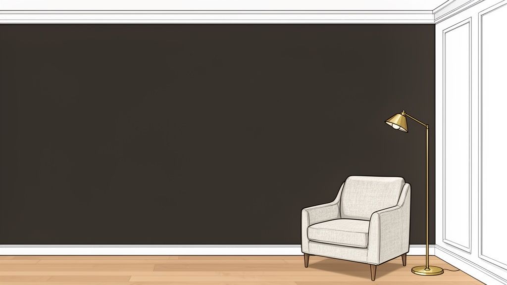
This shade is a favorite in luxury hotel lobbies and high-end residential projects because it exudes confidence and sophistication. For users of AI Interior Design tools like Decor8 AI, Urbane Bronze provides a rich, moody backdrop perfect for generating contemporary or industrial-style renderings. It works exceptionally well on feature walls, cabinetry, and exterior doors, maintaining its depth across various lighting conditions without appearing black.
Why It Works So Well
Urbane Bronze’s success comes from its unique blend of gray, brown, and bronze, giving it a natural, grounded quality. It connects with biophilic design trends that emphasize bringing elements of the outdoors inside. This color was named Sherwin-Williams' 2021 Color of the Year, solidifying its status as a go-to for designers wanting to add drama without sacrificing warmth.
Key Insight: Urbane Bronze creates instant architectural interest. Its dark, saturated nature can make a standard room feel custom-designed by highlighting structural features and creating a sharp, elegant contrast with lighter elements.
How to Use Urbane Bronze Effectively
To harness the power of this dramatic color, consider these tips for both physical and virtual design:
Test on a Feature Wall: Before committing to a full room, use Decor8 AI to test Urbane Bronze on a single accent wall. This helps you gauge its impact without overwhelming the space.
Create Sharp Contrast: Pair Urbane Bronze with crisp white or warm off-white trim (like SW 7008 Alabaster) to define architectural lines and create a clean, high-impact look.
Balance with Light Elements: To prevent the room from feeling too dark, furnish the space with light, airy decor. Think cream-colored sofas, natural wood tones, and metallic accents in brass or gold.
Plan Your Lighting: Proper lighting is crucial. In Decor8 AI, use the lighting adjustment features to preview how Urbane Bronze looks in both bright morning sun and soft evening light before you start painting.
Top 10 Paint Colors Comparison
Color | 🔄 Implementation Complexity | ⚡ Resource Requirements | ⭐ Expected Outcomes | 📊 Key Advantages | 💡 Ideal Use Cases |
|---|---|---|---|---|---|
Sherwin-Williams Alabaster (SW 7008) | Low — simple neutral, easy to apply in AI and real paint | Low — widely available; standard finishes (matte/satin) | ⭐ High — expands perceived space; consistent lighting in renders | Reflects light evenly; pairs with 50+ styles; strong resale retention | Virtual staging, vacant listings, before-and-after renderings |
Benjamin Moore October Mist (HC-156) | Medium — undertones shift; requires lighting previews | Medium — sample testing and Decor8 AI light adjustments recommended | ⭐ High — photogenic, calming green-gray effect | Versatile across contemporary styles; good for multi-room flow | Open-concept visualization, modern/transitional staging |
Behr Swiss Coffee (N510-1) | Low — forgiving, straightforward for DIY and AI | Low — inexpensive and widely available | ⭐ High — consistent across room types; easy to match | Extremely versatile; minimal shift; pairs with many accents | DIY makeovers, family homes, broad design exploration |
Sherwin-Williams Naval (SW 6244) | Medium–High — bold choice; needs test walls and lighting plan | Medium — may need multiple coats; careful styling | ⭐ High — strong focal/directional impact in photos/renders | Creates architectural drama; pairs well with warm metals | Accent walls, trim, high-end staging and dramatic feature areas |
Benjamin Moore Pale Oak (HC-20) | Medium — chameleon-like; best with multi-room previews | Medium — sample swatches across lighting conditions | ⭐ High — cohesive neutral that adapts well across spaces | Eliminates color clash; seamless open-plan continuity | Open-concept homes, multi-room continuity, luxury staging |
Behr Cracked Pepper (N540-7) | Medium — dark tone requires lighting and strategic placement | Medium — careful application; cabinet visualization tools useful | ⭐ High — modern, upscale appearance; hides wear | Strong contrast with light counters; pairs with warm metals | Kitchen cabinets, modern accent walls, contemporary staging |
Sherwin-Williams Accessible Beige (SW 7036) | Low–Medium — generally predictable; test for yellow cast | Low — common professional choice; pairs with natural finishes | ⭐ High — warm, inviting continuity across rooms | Warm yet neutral; highly compatible with wood and earth tones | Whole-home continuity, warm residential staging, transitional design |
Benjamin Moore Hale Navy (HC-80) | Medium–High — dark color needs sizing and lighting consideration | Medium–High — sample boards; careful paint application | ⭐ High — timeless, architectural depth in photos/renders | Classic navy that pairs with whites/golds; elevates value | Accent walls, exterior trim, traditional/coastal luxury staging |
Behr Perfect Taupe (PPU5-2) | Medium — undertones shift with light; preview recommended | Medium — sample testing and curated accents needed | ⭐ Medium–High — sophisticated, mature backdrop | Warm taupe that complements natural materials; ages well | Master bedrooms, spa-like spaces, upscale interiors |
Sherwin-Williams Urbane Bronze (SW 7048) | High — very dark, needs professional application and lighting | High — professional-grade paint, lighting plan, careful testing | ⭐ High — dramatic, architectural statement when executed well | Maximum contrast with light trim; strong visual impact in marketing | Bold feature walls, contemporary/industrial design, luxury marketing |
Bring Your Vision to Life with AI Home Design
Choosing the right paint color is one of the most transformative decisions you can make for your home. As we've explored, the best paint colors do more than just cover a wall; they establish a mood, define a style, and create a cohesive backdrop for your life. From the warm, inviting embrace of Behr’s Swiss Coffee to the bold, dramatic statement of Sherwin-Williams’ Naval, each shade offers a unique personality.
We’ve covered a curated spectrum of possibilities, from timeless neutrals like Alabaster and Pale Oak that provide a versatile canvas, to deep, sophisticated hues like Urbane Bronze and Hale Navy that add depth and character. The key takeaway is that the perfect color isn't just about what's trending; it's about finding the shade that resonates with your personal style, complements your home's architecture, and functions beautifully within your specific lighting conditions.
From Inspiration to Implementation: Your Actionable Next Steps
Now that you're armed with expert-backed color recommendations, the journey from inspiration to a beautifully painted room begins. But before you pick up a paintbrush, it's crucial to bridge the gap between imagination and reality. This is where modern technology fundamentally changes the design process, eliminating guesswork and preventing costly mistakes. The most critical step is to visualize these colors in your actual space, with your furniture, your lighting, and your unique architectural details.
Here’s how to move forward with confidence:
Revisit Your Favorites: Review the colors we discussed, like the soft gray of October Mist or the dependable warmth of Accessible Beige. Shortlist three to five top contenders that you feel are the best fit for your project's goals.
Analyze Your Space: Pay close attention to the room's natural and artificial light sources throughout the day. A color like Behr's Cracked Pepper might look sleek and modern in a sun-drenched kitchen but could feel too imposing in a poorly lit hallway.
Consider the Existing Elements: How will your chosen color interact with your flooring, furniture, cabinetry, and artwork? The goal is harmony. A warm greige like Pale Oak is renowned for its ability to tie together disparate elements.
Why Visualization is the Ultimate Design Tool
Mastering color selection is about more than just picking a popular shade. It’s about understanding the intricate dance between color, light, and space. In the past, this process involved endless paint swatches, sample pots, and a great deal of uncertainty. Today, AI Home Design tools have revolutionized this experience, making professional-level visualization accessible to everyone.
Instead of trying to imagine how a tiny paint chip will translate to an entire wall, you can see it instantly. An AI Room Design platform allows you to virtually "paint" your walls in seconds. You can compare different shades side-by-side, test bold accent walls without commitment, and see how a color choice will flow from one room to the next. This ability to experiment freely is invaluable, saving you time, money, and the frustration of a color that just doesn't feel right. By leveraging AI, you empower yourself to make informed, confident decisions that ensure the final result is exactly what you envisioned.
Ready to see how the best paint colors will look in your home? Stop guessing and start visualizing with Decor8 AI. Simply upload a photo of your room to test any of the colors from this article and find the perfect shade with absolute confidence. Try Decor8 AI today and bring your design vision to life.